 "Gamecat235" (Gamecat235)
02/12/2014 at 12:15 • Filed to: design, fonts, typeface, escher
 1
1
 5
5|
"Gamecat235" (Gamecat235)
02/12/2014 at 12:15 • Filed to: design, fonts, typeface, escher | 1
| 5 |
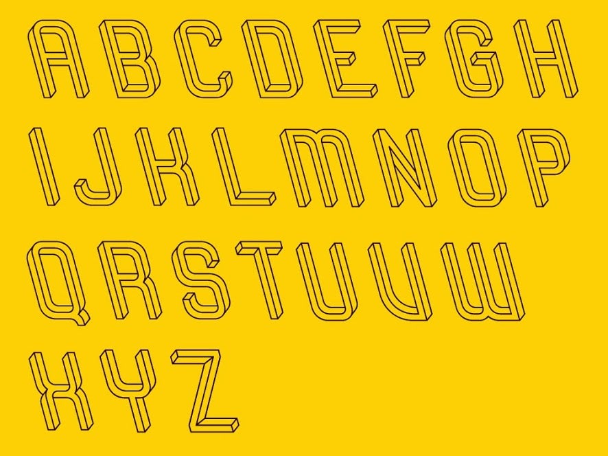
This is one of the most awesome fonts I have ever seen. But I think I just sprained my brain. For more information on !!!error: Indecipherable SUB-paragraph formatting!!! 's font and a neat little write up on the impetus for how this came to be, see the piece which Wired just put up !!!error: Indecipherable SUB-paragraph formatting!!! .
 Laird Andrew Neby Bradleigh
> Gamecat235
Laird Andrew Neby Bradleigh
> Gamecat235
02/12/2014 at 12:25 |
|
That is AWESOME... But I'll kill, strangle, mangle and maim anyone who uses taht font in a proffesional setting :P
 davesaddiction @ opposite-lock.com
> Laird Andrew Neby Bradleigh
davesaddiction @ opposite-lock.com
> Laird Andrew Neby Bradleigh
02/12/2014 at 13:23 |
|
Unless, of course, it's for a headline of an article that deals with things that bend the mind...
|
Laird Andrew Neby Bradleigh
> davesaddiction @ opposite-lock.com
02/12/2014 at 13:41 |
|
Of course, then I'll only scream :)
|
davesaddiction @ opposite-lock.com
> Laird Andrew Neby Bradleigh
02/12/2014 at 13:48 |
|
The Jüdisches (Jewish) Museum in Berlin has floors and walls that are slanted, and gives you an immediate feeling of unease as soon as you enter the building. It's a profound effect, especially when dealing with a subject as horrid as the Holocaust. I'm sure Liebeskind, the architect, had to convince his builder he wasn't insane to make off-level floors is a museum meant for many people to pass through every day, but it was worth the effort.
|
Laird Andrew Neby Bradleigh
> davesaddiction @ opposite-lock.com
02/12/2014 at 13:55 |
|
I've been there, it's rather unsettling at first. But it sure does something to you, and that is a good thing.